Using EyeOnWater Mobile App
EyeOnWater is organized in three sections or pages: Overview, Usage and Account. Use the corresponding buttons located along the bottom of the screen to jump to any section.

The name associated with your EyeOnWater account is displayed at the top of the screen. When more than one location is linked to your EyeOnWater account, the number of locations is displayed under your name.
TIP: To add locations to EyeOnWater, contact MOC using the links in the Customer Service section of the Overview page.
If you have more than one location linked to EyeOnWater, use the Account menu to view usage at different locations.
Tapping ALL Accounts opens the Locations page. Tap a Location to select it, and tap Done to view it on the Overview and Usage pages.
Overview
From the Overview screen you can:
- See whether EyeOnWater has detected a leak.
NOTE: To take advantage of leak detection, use a web browser and follow these instructions to set a leak alert.
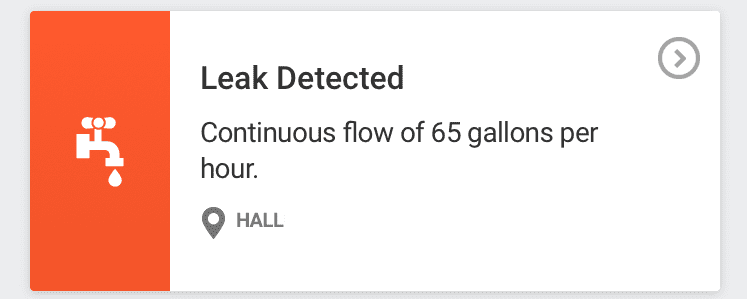
- Tap anywhere on the card to get more leaks details.
TIP: Tap any card with an arrow in the upper right corner to see more details.
- If you have more than one account, use the drop-down menu to jump to the Accounts page and select the location you want to view.
- Quickly see how your current usage compares to that of the previous week.
- See a graph of your water use for each day of the current week.
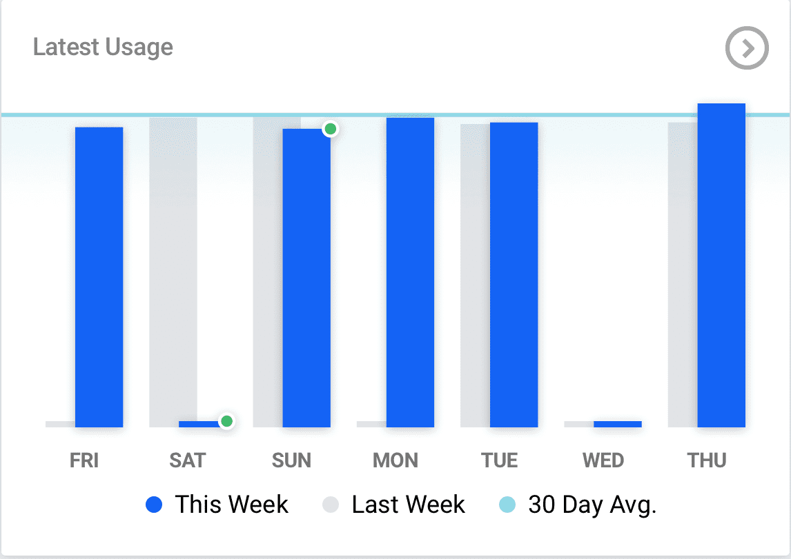
Green dots indicate lower usage than the previous week on that day. In the example above, usage on Saturday and Sunday was lower than during those days of the previous week. Tap the arrow in the upper right corner to jump to the Usage page.
Contact MOC customer service center using convenient links:
- Website opens MOC's web page
- Call initiates a phone call to MOC
- Email opens an email, automatically addressed to MOC.
Usage
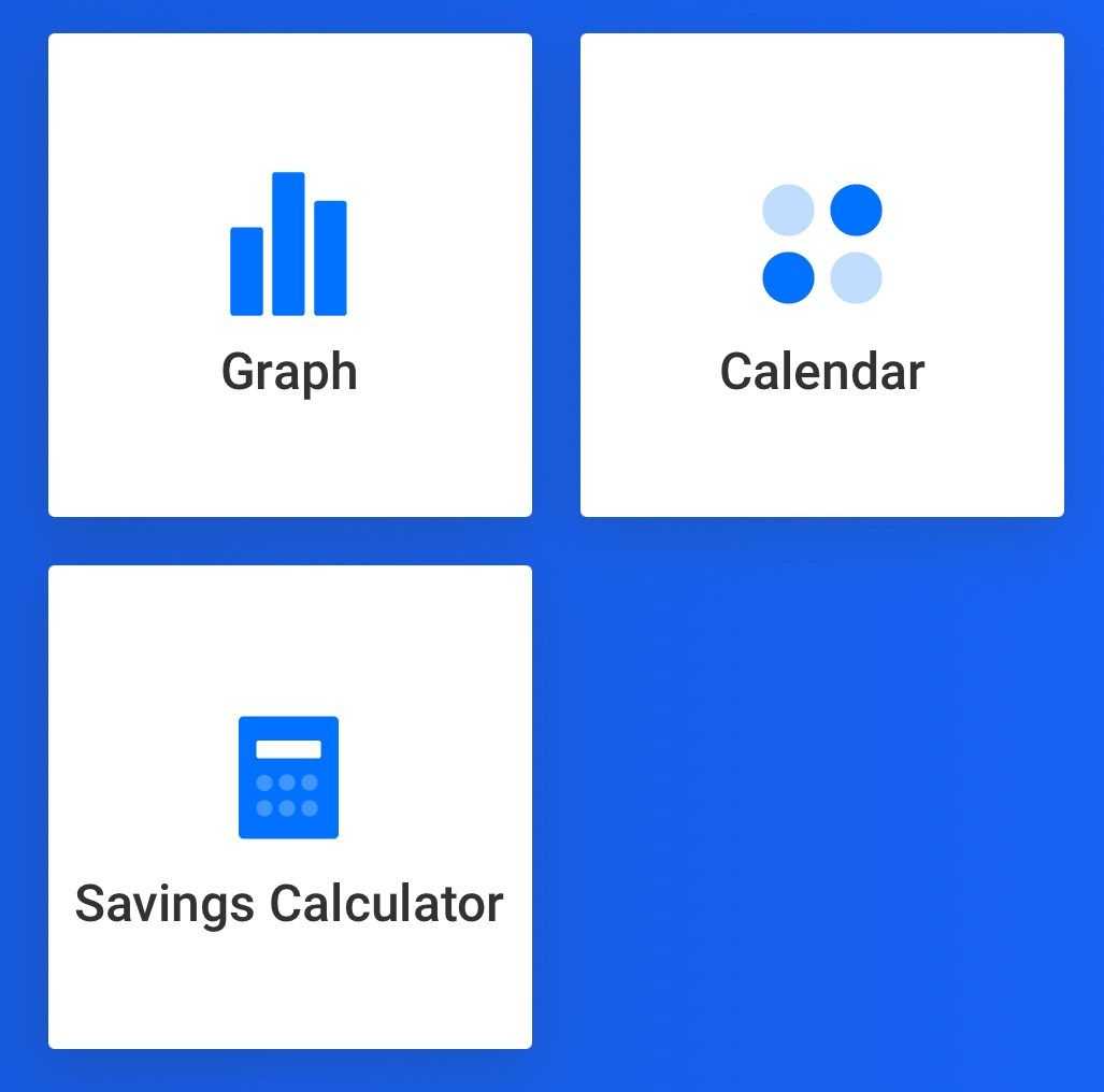
The Usage page lets you quickly get a Graph, Calendar and Savings Calculator view of your usage history.
Tap Graph to see a graphical representation of water use. Tapping Day, Week, Month, Year or All lets you see your:
- Usage for a Day.
- Usage for a Week (shown below).
- Usage for a Month.
- Usage for the Year.
- Usage for each year your account has been active.From any of these screens, tap to select a day, week, month or year and see how much water you used. Current selections are blue, while other bars of the graph are gray and remain visible to allow you to compare usage.
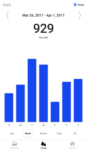
- In this example, the week of March 26 – April 1 is shown. The overall usage for the week was 929 gallons. Tap the bar for a given day to see how much water was used that day.
TIP: To compare usage on different days, weeks, months or years, swipe and keep touching the screen. The vertical scale of the graph changes when you stop touching the screen. In the gif above, notice the maximum use for the week of May 28 – Jun 3 is 184 gallons. The next week’s maximum is 580 gallons. Continuing to touch the screen retains the scale from the previous week, giving a better comparison between screens.
Calendar
Tap the Calendar section of the Usage page home screen to see your usage trends as a “heat map” in which light blue dots indicate less use, darker blue dots indicate more use. Red dots denote leaks. Tap the i to open the Usage Key.
NOTE: For any given day, the color of each dot is determined by comparing that day’s consumption to a rolling average of the previous 30 day’s usage.
Tap to see more detail for any given month or day.
NOTE: For any given day, the color of each dot is determined by comparing that day’s consumption to a rolling average of the previous 30 day’s usage.
Tap to see more detail for any given month or day.
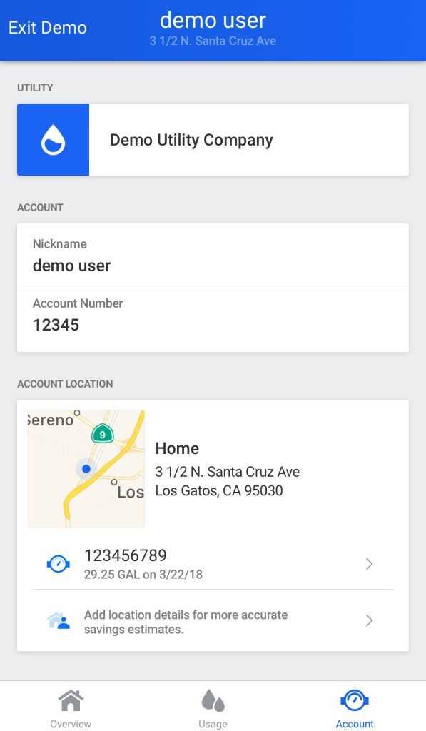
Account
The Account page lets you see your account details. In addition, your account location is displayed on a map along with your meter ID number.
NOTE: Locations can have more than one water meter. If yours has more than one meter, their Meter IDs will be displayed in the Account Locations section.